Markets EQ: A mark for market intelligence — designed to sit quietly above the data.
Markets EQ's product is a dense dashboard. The identity's first job is to stay out of the way — no colours that fight with data ink, no display faces that make the header heavier than the chart underneath.

Wordmark — light and dark variants
Impact
What moved, and by how much.
Colours that compete with bull-green or bear-red
Wordmark reads as orientation, not headline
Scales from favicon to marketing header
Balanced counters — a visual pun on equilibrium
01 · Brief
Sit above the data, quietly.

02 · Mark
EQ as equilibrium.
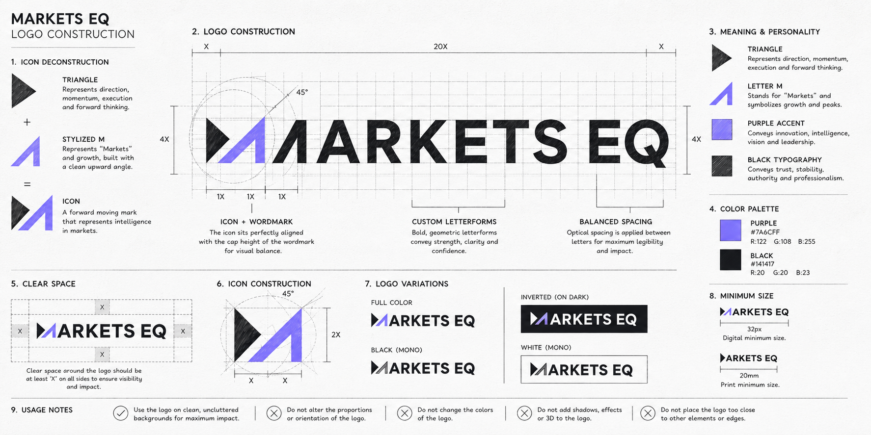
The mark abstracts the "EQ" into two balanced counters — a visual pun on equilibrium that scales down cleanly to a favicon and up to a marketing header.
03 · In use
Across product surfaces.

“In data products, the brand is a supporting actor — its job is to make the data look right.”
Brand principle — Markets EQ
Key takeaways
What I'd carry forward.
Design from the dashboard outward
Every optical decision came from the dashboard header.
Quiet, not restrained
Confidence at low volume beats loud brand debt.
Prototype in the product
Mockups always flatter chrome — build against the real UI early.