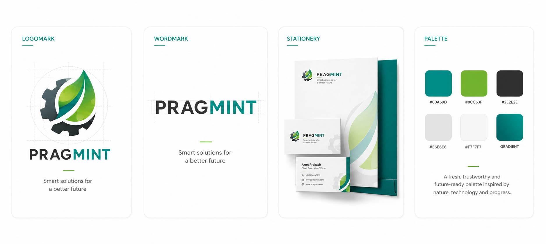
Pragmint: A pragmatic mark for a young company — simple beats clever.
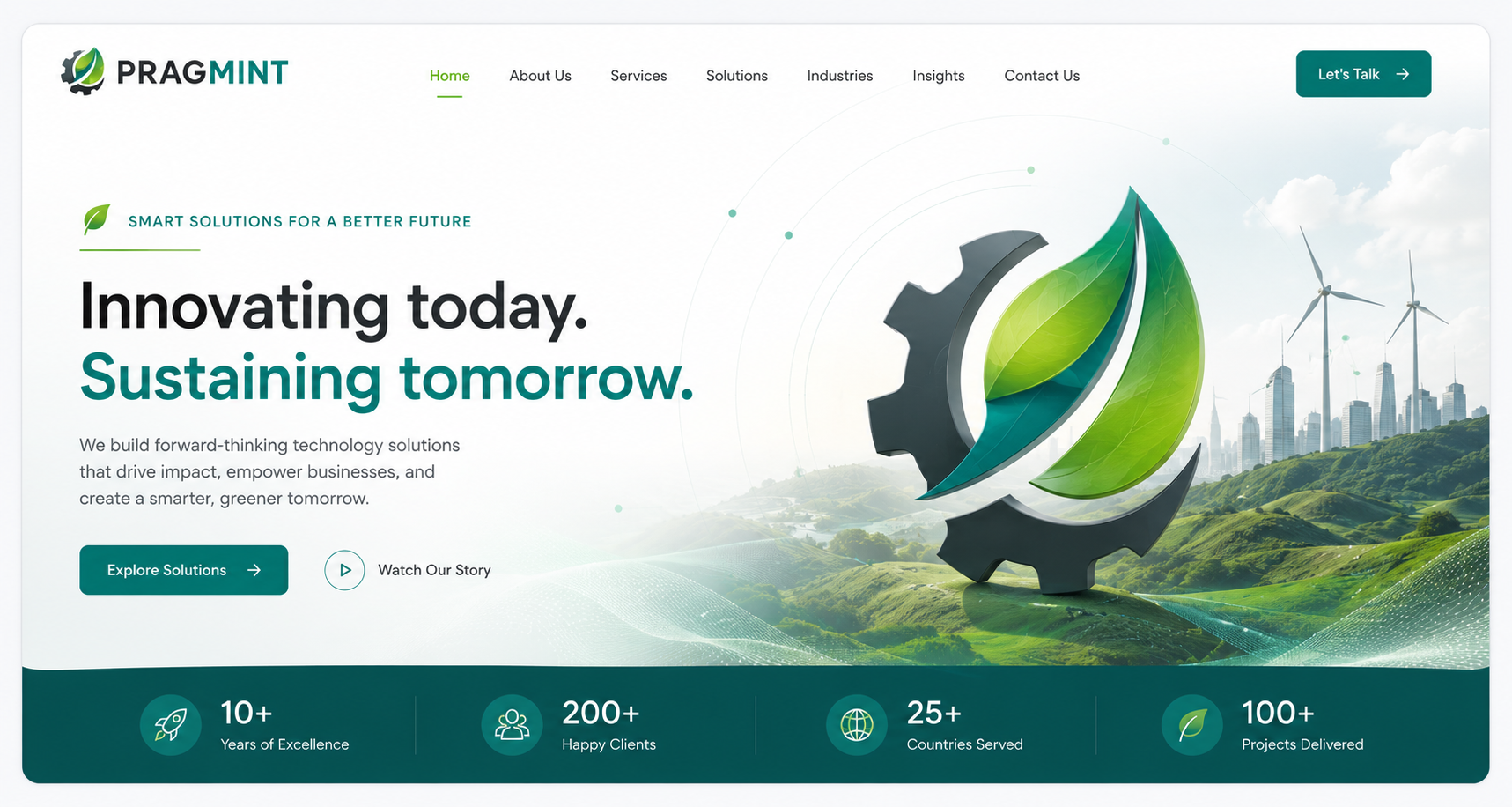
A startup identity for Pragmint — the smallest system that could still feel like a company. Enough to raise, hire and land, but nothing that would look wrong when the product pivoted.
Impact
What moved, and by how much.
One wordmark, one type stack — no visual debt
Sized for a company still finding its shape
Founder can ship without design help
01 · Brief
Design for a moving product.
02 · Mark
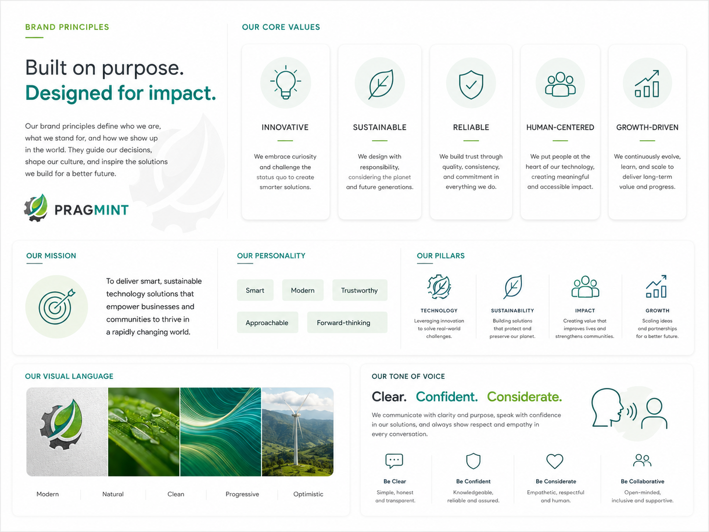
Simple beats clever.
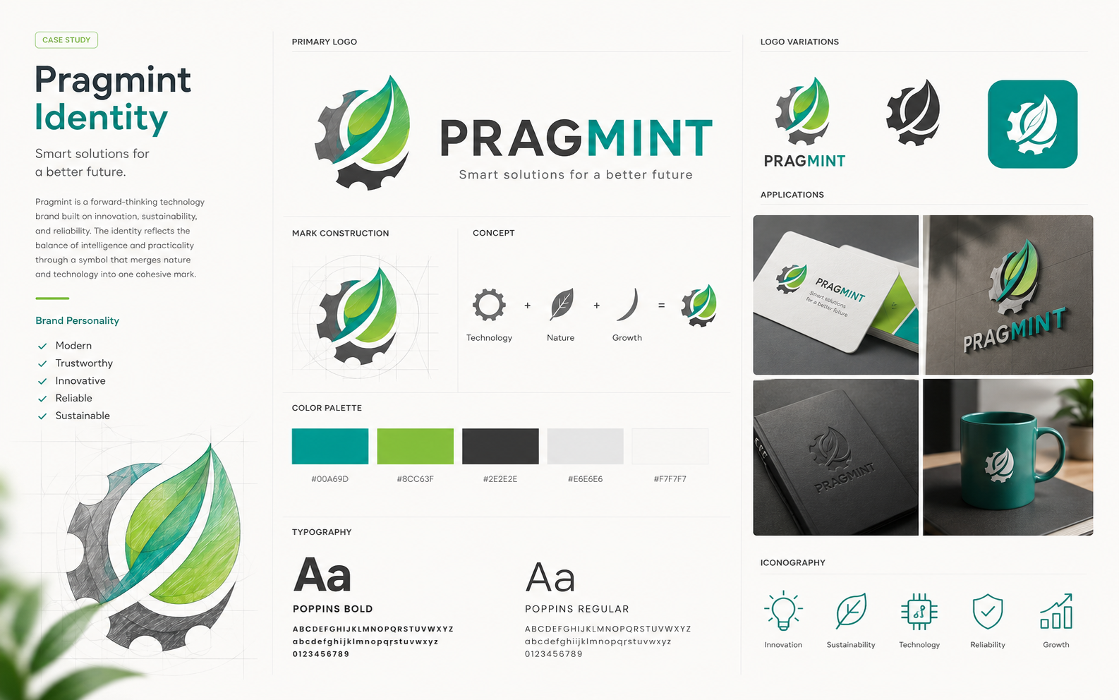
A geometric wordmark and a compact monogram — no metaphor that would date, no clever negative-space trick that would need to be re-explained on every intro call.
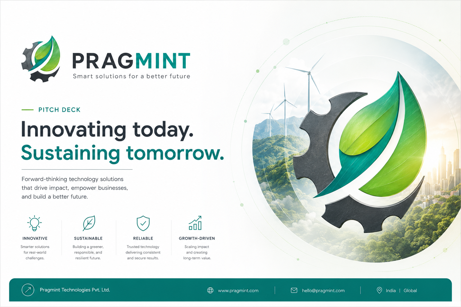
03 · Applied
Deck, landing, hire post.
“Muthu Krishnan helped me with the initial branding of a new venture of mine. He produced many original works for me to choose from all at a great price! The hardest part of working with him was picking a single option as many of them were very good. That's a testament to his abilities.”
Dave Moore — Co-founder & President, Pragmint
Key takeaways
What I'd carry forward.
Ship compact, ship fast
The founder needs to get back to product, not iterate branding.
Nothing to unwind later
A modest identity leaves the runway open for the real one.
Set expectations up front
Name this what it is — a launch identity, not forever.