Worldtech: A confident wordmark for a consumer-electronics range that lives on marketplaces.
An in-house identity rebuild for a Thai consumer-electronics brand — a single confident wordmark and a modular icon system that reads clearly at 12px on a Shopee tile and at 3m on a retail endcap.
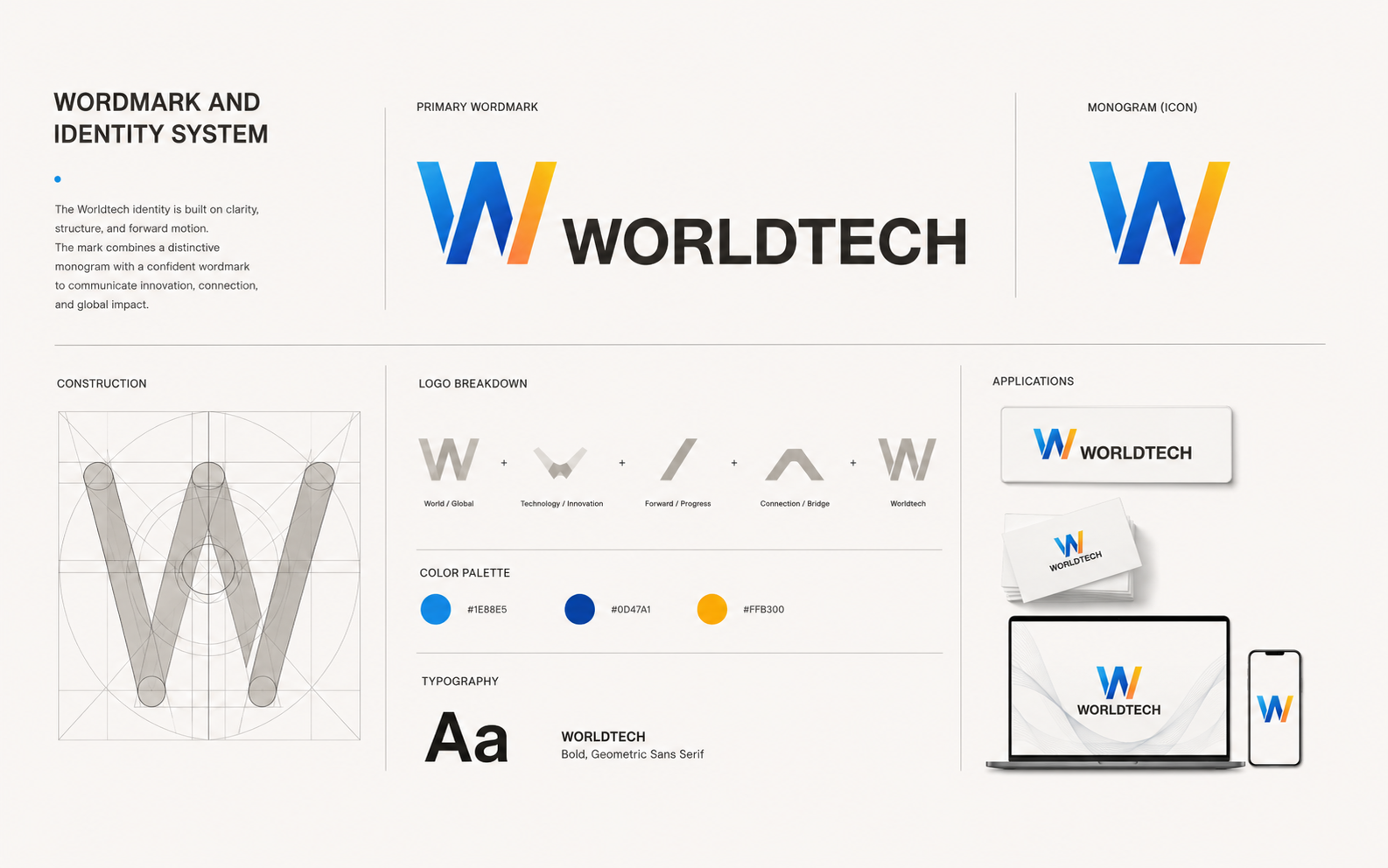
Primary wordmark — clear-space and minimum size
Impact
What moved, and by how much.
Legibility floor on marketplace thumbnails
Product ranges unified — TV, camera, audio, appliances
Delivered from research to print-ready files
Icon grid, stroke and radius across the system
Context
Why the mark had to change.
Worldtech ships across marketplaces (Shopee, Lazada) and physical retail. The old mark fell apart at small sizes, competed with product photography on tiles, and left the appliance and camera ranges feeling like different companies.
The rebrand had to give sales one confident mark, unify the range under one typographic voice, and stay recognisable in monochrome print on cartons.
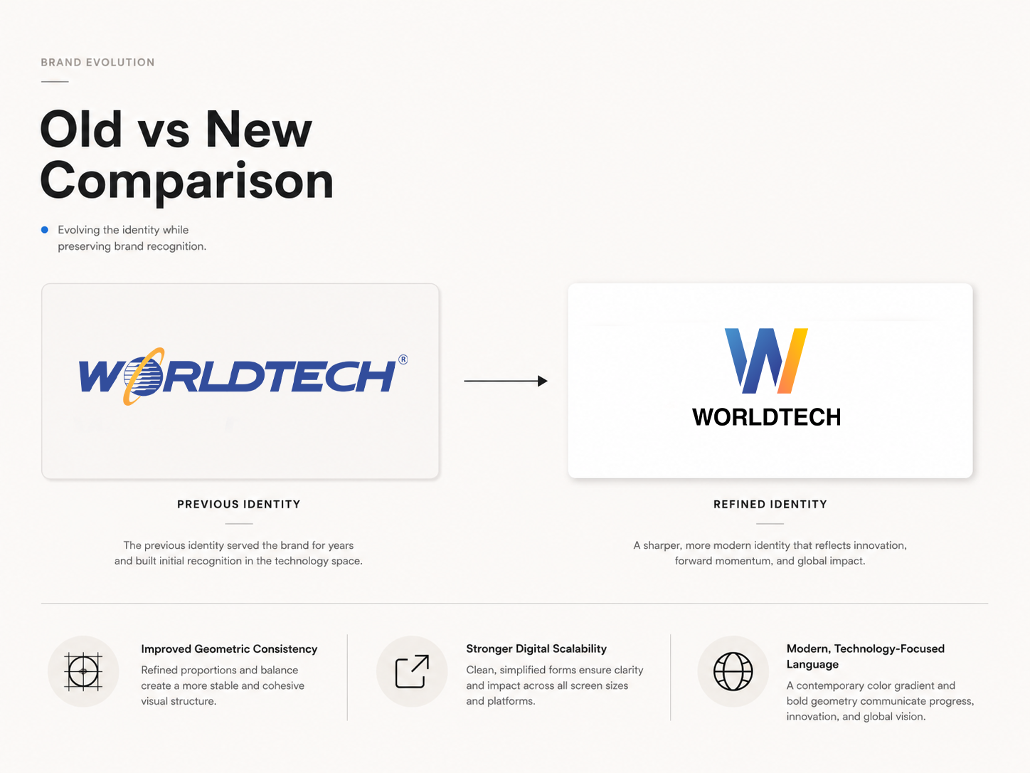
01 · Wordmark
Built to survive a marketplace tile.
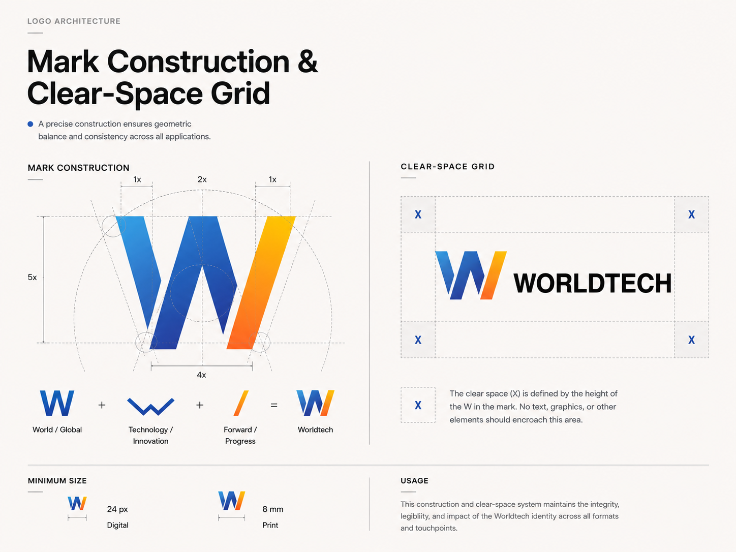
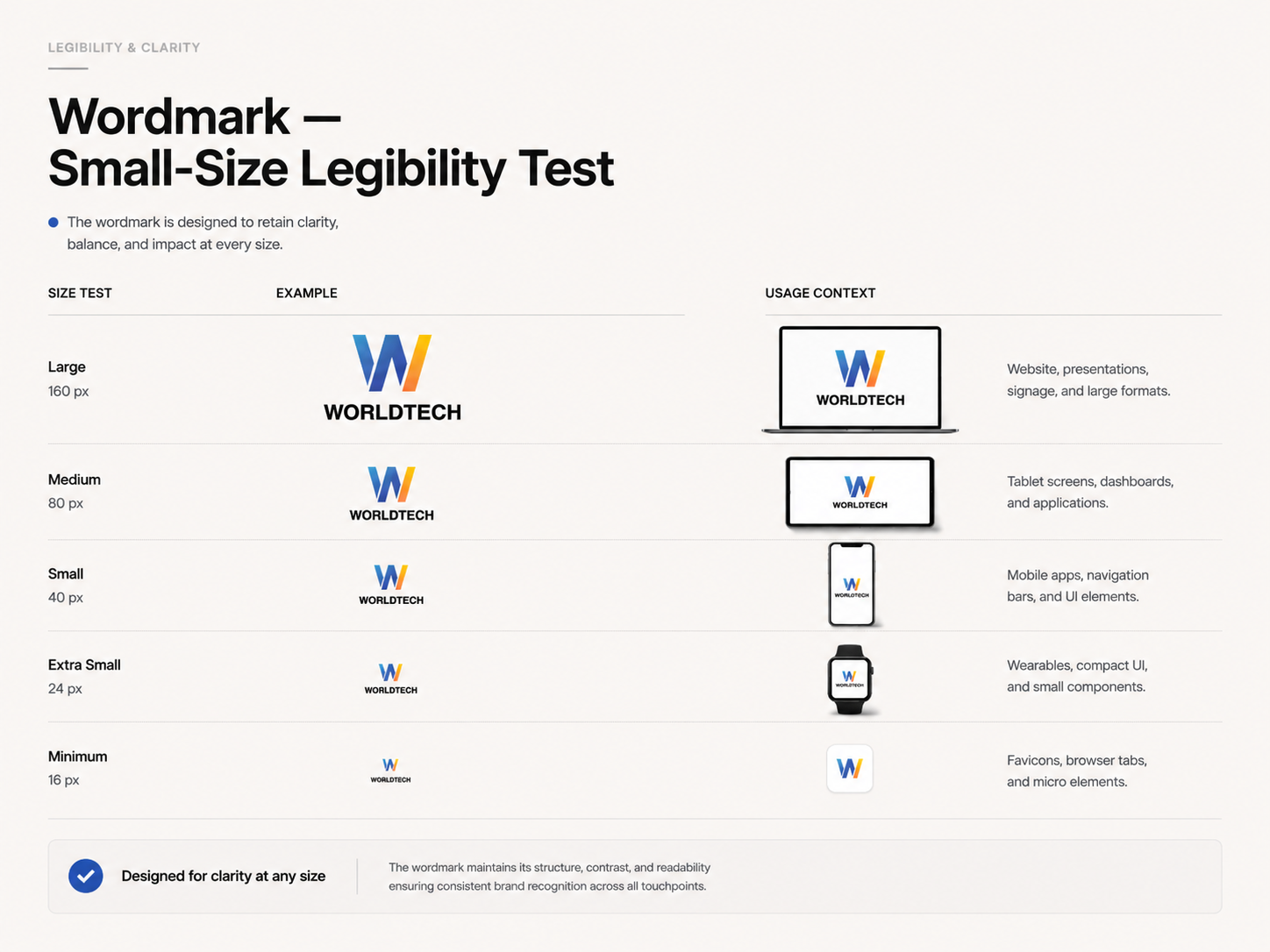
The wordmark tightens counters, evens optical spacing and drops flourish so it survives aggressive downscaling on Shopee thumbnails. A geometric mark distilled from the "W" runs alongside for favicons and product badges.
“The smallest surface is the brand's real home page — every optical decision starts on a Shopee tile.”
Brand principle — Worldtech rebuild
Key takeaways
What I'd carry forward.
Design from the hardest surface
The marketplace tile constraint shaped every other application.
One grid, many categories
Shared stroke, radius and grid unify visually different product ranges.
In-house can go far
Research through print-ready files, no agency — with a tight system.